Tuesday, May 31, 2011

Tiddly Inks Darling Diva Challenge


This week our Tiddly Inks Challenge is Darling Divas. I couldn't help but go with Flora, one of the Tiddly Inks Gothic Pin-Ups. Tell me this girl doesn't look like a DIVA, with her voluptuous hair (and bod) and gorgeous vintage outfit? I was sort of getting a French vibe so I went with beautiful flocked DP and a border from the GCD Studios Paris Nights collection. The striped mat is from DCWV La Creme Stack. The both mats are cut with my Nesties Mega Ovals and Mega Classic Scalloped Ovals LG and I've added a flocked sticker by Stampendous behind her. The quote is from Mae West (it's missing a "very" but it wouldn't fit in the oval, LOL). Can you think of a bigger diva?


Flora was colored with Copics and popped for dimension as are the the sentiment ovals. The vintage looking brads are by Recollections. Besides our fabulous Diva Challenge at Tiddly Inks, I'm also entering this in the Sweet Stampin Oh La La Challenge which is either something French, or cheeky/saucy. (I'd call this is both, HeeHee!) Be sure to stop by the Tiddly Inks Challenge Blog for tons of inspiration by the rest of the Tiddly Inkers and we hope you can play along. Pop over to Christy's Blog for a peek at a new image and a little freebie, too. And if you haven't already, scroll down for my BBTB2 Blog Hop Post and leave a comment for a chance to win a $40 gift certificate from Custom Crops.

Monday, May 30, 2011

BBTB2 Celebrations Cake Challenge and Blog Hop


Happy Memorial Day! I hope everyone is enjoying the long weekend and is ready for a fun Blog Hop with BBTB2, but first, please remember to say a little prayer of thanks to those who have sacrificed to keep our county free. This week our super sweet and uber talented DT sister Carole has chosen the cake from the Celebrations cartridge. You should have arrived from Carole's Blog if you're hopping along. This is a pretty simple cake and there's lots you can do to dress it up, but when I found the fabby DP from the DCWV Sweet Stack, I pretty much left it plain and let the paper do the work. This cut comes without an attached candle, so after welding the regular cuts together in DS for the card base, I welded the shadow of the cupcake from Doodlecharms to the first mat. The sentiment is from Sweet Treats. Both the candle and the word "wish" are covered in German Glass Glitter in Sea Shell available at Custom Crops. I love this stuff! It gives a cool texture that you can't get from any of the other glitters around and is particularly gorgeous on vintage projects. Lots more colors available too.


The popped layers aren't that obvious from the front, but they're there. I have to say this is one card that really does look cuter IRL. The only embellies are the gold adhesive beads and a single tiny Prima rose. (I've shown amazing restraint this week, LOL)


Here's a peek at the inside of the card. When you're making a shaped card with a delicate base like this one, it's important to reinforce the card back. Instead of just a single mat of the regular cake cut, I added an additional shadow of the cake plate AND topped it with a regular cut of the cake plate to make sure it was sturdy enough to stand. Now hop along to our beautiful Krista's Blog. Krista's gorgeous, cheery creations never fail to make me smile but don't forget to leave a comment here before you go for a chance to win a $40 gift certificate to Custom Crops. Be sure to check out their Memorial Day sale too. They are giving away a free stamp with every order. Also, if you don't have a blog, please check back next Saturday for the winner and leave a way to get in touch with you or you'll miss your prize.


Sunday, May 29, 2011

Macabre Monday EMO Challenge


This week at Haunted Design House our sponsor for our Macabre Monday Challenge is Simply Betty Stamps. WooHoo! In honor of her fabulous EMO stamps, the challenge is to use elements on your project that begin with the letters E, M, and O. My image is Zombie Christian, one of the Zombie Teens collection of clear and rubber stamps. He is colored with Copics and Gel Pens and fussy cut and popped from the background. My elements are E=torn Edges on the fab Grunge Checkerboard digi paper from Tiddly Inks and Skull border from the Toasting Properly Paper set, M=METAL, as in the metal paper clip holding the computer generated sentiment, and O=the color ORANGE.


Here's a closer look at Christian. Is he not one cool DUDE? Fabulous detail on this image and so much fun to color! Christian is one of the Everyday Zombie Teens and there is is a new release of Summer Zombie Teens as well. I'm thinkin' this would be a great belated birthday card for a teenage boy. I'm sure you'll want to play along with this challenge for a chance to win some Simply Betty Stamps of your own. The rest of the Minions have more fabulous inspiration for you so don't forget to pop by Haunted Design House and check them out.

Whimsical Wednesday Tag Challenge


Okay, it doesn't look like a tag, but I'm using some "artistic license" here. I made it as a tag, so it IS a tag. My DH looked at it and said "Why are you calling it a tag? Isn't it kinda BIG?". I'm calling is a tag because that's what the Whimsical Wednesday challenge is. Make a TAG! Honestly, I started out designing a proper tag, but it took on a life of it's own, and who am I to stop the creative juices when they're flowing like wine (No, I wasn't drinking when I made this, I promise!) Anyway, I had leftover bird parts (OOOh, that sounds like something the cats dragged in...literally, EEEeeewww) from my BBTB2 Challenge card this week and was afraid I'd lose them so I assembled another version. See the first HERE. The bird is from Florals Embellished and I cut it using the silhouette feature in two shades of blue (at 4 inches) and had enough cuts to actually do 3 versions (so you just may see version 3 showing up in the near future on something else. Hope you're not TOO bored with it.) Of course I had to cut a bunch of white bases, but they're easy compared to the silhouette cut. If you're gonna do this bird, cut it BIG, like I did and use the multi-cut feature on 2 and you'll be good to go. "Fly" came from Straight from the Nest and it's cut at 5 inches. The sizing on Cricut always cracks me up. It is 5 inches from the top of the "F" to the bottom of the swirl but it's 12 inches long! Yeah, I'd say it's a BIG tag! LOL

Nothing too fancy going on here. I welded the shadow of "Fly to the shadow of the bird using DS and then added the layers. I cut 2 extra regular white layers so I could pop the wings making it look a bit more like it's flying and then popped the whole thing on the tag. My bling is a little subtle. I've used adhesive pearls, but yes, it's a TAG! See the ribbon hangy things on top? So what would I use such a huge tag for? How about a big Graduation gift, like a computer, or TV or better yet, a CAR! Works for me. I'm also entering it in the Allsorts Challenge, Things with Wings, and the Anything Goes Challenge at a brand new Challenge Blog called Crafting for All Seasons.

Friday, May 27, 2011

The Altered Alice "Time" Challenge


Honestly I have but a few moments to spare. I've been trying to enter The Altered Alice Challenge for months and things have conspired against me. Not exactly what I had planned, but it works. Have to post. I'll be back!

I MISSED IT!!!! I'm gonna CRY!!!!! SERIOUSLY! This card did not want to happen. I originally designed it in Cricut Craft Room LAST WEEK and it WOULDN'T CUT! WTF! I spent hours learning the program only to find out that the ONLY cartridge I chose to use (Celebrate With Flourish) wasn't recognized by the new software, huh? the words are from All Mixed Up which sort of fits. Don't get me started on this... Well, no time to redesign because I had DT projects to do and post and gee, maybe some laundry and cooking? So this week I redesigned the card in DS. But colors and patterns? and worse yet, I'm feeing BLIND with new contacts and I had another appt TODAY which was even WORSE! Just kill me now. Maybe I should hang up all this crafting stuff. Between that and arthritis. Maybe time to put this old girl down. (Can you tell I've had a couple of glasses of wine with lunch? Probably a bad idea, but... ) the fab stamps are The Octopode Factory. And blind me had a B--tch of a time coloring them but I was DETERMINED! But it was all for NOUGHT because I MISSED the CHALLENGE. SERIOUSLY, SHOOT ME NOW!!!! (But not until I have another glass of wine!) Now I wish I taken the time to flock and emboss the hat, oh well...

UPDATE!!!!!! Lynne to the RESCUE!!!!! The clock to Linky was 7 minutes fast so I was entered! WooHoo!!!!!! I love you Lynne! Thanks so much. (Bet you guys think I'm nursing a hangover, but I'm not, HA!)

And ANOTHER update!!! WooHoo! I'm so happy and proud to be among the Honorable Mentions for this challenge! What an honor to be chosen. The entries were AMAZING! See them HERE, and thank you so much!

Thursday, May 26, 2011

A New One for Tiddly Inks


This new Imagination stamp from Tiddly Inks really took me back. I used to just get lost in books, especially during summer vacation. I spent hours and hours outside, transported to worlds unknown. Oh, to have that time again! I have to apologize for the coloring. I'm having a bit of trouble with new contacts that I hope to have corrected on Friday, but in the meantime, my close up vision stinks. Besides that, I printed the image quite small to fit into my Nesties Labels Seven die and tried that "dotty" technique with my Copics on much of the background, somewhat unsuccessfully. (Oh crap! Now that this is posted I realize I didn't finish coloring in the bunnies' ears and noses either. Well, At least that's fixable!)

I wanted the image to look like it was a part of the book so I cut several of the largest size Labels Seven and cut a Classic Rectangle out of the top one. Then I curved and popped the layers. I added a little twine bookmark for embellishment. The DP is Heidi Grace as is the "imagine" rub on. The top words are just how I felt during those carefree summer months. They are also rub-ons from K&Co. Don't forget the Manly Men Challenge at the Tiddly Inks Challenge Blog this week and stop by Christy's blog for a peek at the new images and freebie at the Store. I"m also entering this in My Partner in Crafting Crime's Twine, Jute, or String challenge.

Tuesday, May 24, 2011

Bah! Humbug! Kinetic Cards Challenge


OOOh, those ladies at Humbugger Hall really tossed us a toughy this week. The challenge is Kinetic Cards, or cards that move in some way. I knew I couldn't leave this one 'til the last minute and wracked my brain until I remembered the Snow Angel cut on Winter Frolic. Quite frankly, that cart is a little too cutesy for me to use often, but it sort of saved my butt this time around. I designed a shaped card in Design Studio that rocked because of the curved base. WooHoo! but I didn't want to stop there. After layering up the little kiddle I stuck her on an Action Wobble so she actually moves like she's making a snow angel. I cut an opening the size of her face in the parka layer and trimmed it and the sleeves with a snow writer and added Polar White Flower Soft. Then I popped the parka and boots that are shiny with Glossy accents. (Remember those red boots we pulled on over our shoes a bazillion years ago?) The face and hair are colored with Copics and the funky face is hand drawn. Clearly, I need some Peachy Keen Stamps, LOL The words are rub-ons by Melissa Frances. I also added some pom poms to be eligble for the Winter Wonderland Give us a "P" Challenge (and there's a bit of pink on there too).


I tried hard to get a real blurred action shot with the Wobble really doing it's thing, but my camera stopped the motion every time. (Clearly I need photography lessons, too) But you get the general idea don't you? So yea! for once I'm not scrambling at the last minute and you've got a day to join in too if you're so inclined. At least be sure to check out the cool kinetic cards the Design Team has made and the lovely cards on Winter Wonderland with elements starting with "P".

Monday, May 23, 2011

BBTB2 Florals Embellished Flying Bird Challenge


Happy Monday, everyone! I'm pretty excited today because it was my turn to pick the challenge for BBTB2. While browsing through the manual of Florals Embellished, I fell in love with the beautiful birds, particularly the flying one on page 61. I immediately knew the "theme" for my card but it took me awhile to pull it all together. There are two different ways to cut the bird on Florals Embellished, the layers, or the silhouette. I chose the silhouette, but had a hard time choosing colors so I cut it several times in varying shades of blue and mixed and matched until I got a combo I liked. The dark body and outline are actually the negative cuts from that color but I likes the extra white border that gave me against the darker shadow. Now I've got lots more bird cuts that I can combine for other projects. The banner, from Happy Hauntings, had the word "caution" cut out of it, so I hid the contours and spelled out "dreams" using the font from Cindy Loo. I ended up cutting it 3 times (once with the letters, once in solid blue and once in solid white) and gluing the light blue behind the "dreams" layer and trimming the edges off to make it more dimensional. Because everything was pretty clean, I was afraid to ink it up, but I did use my Copics color CO to shadow the banner cuts slightly around the edges (although it doesn't show in the pix.

For the base, I welded two of the "doilies" from Cindy Loo and the shadow of the bird and shadow of the banner from Happy Hauntings. The shadow of the doily had different shaped scallops, so I had to hide all of the contours on the back of the card to get a solid scalloped square that matched the front.

Yeah, this turned out to be another fat one, alright. It started growing when I decided to give the wings multiple layers to simulate flight. There are 3 white layers to the bird, but they are all glued together at the body.

Two of the layers are glued together at the tail and lower wing and popped from the third and all 3 layers are separated on the top wing. The light blue embossed areas of the wings are glued near the body and popped near the edge for further dimension. I did the same for the shadows of the banner, popping all three layers through the center, but gluing two of the layers together at the ends to make it look more curved.


Notice when the card is open, the front is flush because I welded it all together, instead of just popping the elements on top. That way you don't see all the "mechanics". It also makes for a much sturdier base for all the dimension. Inside is the first verse of the poem "Dreams" by Langston Hughes, which is the inspiration for this piece. In case you can't read it, is says:


Hold fast to dreams


For if dreams die


Life is a broken-winged bird


That cannot fly.


It reminds me that no matter how great the obstacles may be, it's our dreams that keep us alive. I intend to keep dreaming and believing, until they come true. xxD

Sunday, May 22, 2011

Macabre Monday Necro Neckware


We have a really exciting challenge at Haunted Design House this week for all you budding artists out there. Our sponsor, Kasket Kustoms (Accessories to DIE for! SERIOUSLY!) is giving those who submit original artwork that can be turned into a pendant the opportunity to win. Check HDH for all of the deets. We have some seriously gifted artists at HDH and I really didn't plan on even participating this week. But what the hey? Since I couldn't compete on any serious level, I decided to doodle a bit and came up with this funky VooDoo Doll. (Yes, I know his arms are out of proportion and he's weird as all get out, but I colored him up anyway and stuck him in a memory frame.) I added some vintage buttons and a vintage pin (honestly it's rusted) that I got from my dear friend Joy. (Sorry Joy, I doubt this was what you had in mind when you sent me these. Hee hee!) I kinda got a kick out of it, though But if you REALLY want to see some fabulous creations, check out Haunted Design House and be sure to play along for the possibility of having your design turned into a fabulous piece of jewelry by Kasket Kustoms.

Friday, May 20, 2011

Whimsical Wednesday Back to Basics Challenge


I'm always anxious to see what the next Whimsical Wednesday Challenge is, even if I'm unable to play along. This week's was intriguing; create a card using "old school" methods (meaning NO Cricut!) My Cricut was the start of my paper crafting, so I really didn't have a stash of "old school" stuff before I bought it, but that didn't stop me from accumulating monstrous amounts of stickers, rub-ons, etc, just because they looked cool to me. One thing I do have a history of is decoupage, though. There was a store in my town, when I was in high school that sold multiple images of various scenes and objects to fussy cut and pop to make 3-D artwork and I bought several copies of a Model T car and spent hours cutting away and assembling the layers to mount in the lid of a jewelry box for my first love. I'm thinking that was the start of my infatuation with dimension. Although my card is not nearly as detailed, I used the same method with several copies of a botanical print from the Julianne Designer Mat pad from K& Co. The striped paper behind is also from that stack.

The color scheme and dimensional layers are quite subtle so I decided to make this a Sympathy card. I guess my "old school" element, besides the method itself, is the peel-off sticker sentiment that I colored with my Copic marker to match and mounted on Petite Scalloped and Petite Oval Nestie die cuts. The only embellishment are some adhesive pearls. Be sure to stop by Whimsical Wednesday to see what the fab DT has cooking, and remember, the challenges run for two weeks so there is plenty of time to play along. (OOOh, this makes 2 in a row for me, yahoo!)

Wednesday, May 18, 2011

Bah! Humbug! Snowflake Challenge


This week the Bah!Humbug! Challenge is Snowflakes. Believe it or not, CA is experiencing some very unseasonable weather, including snow in the Sierras and hail right near here, so this was not a stretch. I wanted to do something a bit different so my card fits a legal size envelope. The white mat was embossed by one of the bazillion snowflake folders I own and it does say Cuttlebug on it, but where it came from is anybody's guess. (A bundle, an exclusive? Who knows?) The oval is cut with my Nesties Mega Ovals LG. The snowflakes are cut from Grafix ShrinkFilm in both the White and Matte. I have found this brand works better than the brand carried at my M's and it's available in other colors (including clear for stamping) at Custom Crops. The snow flakes were cut in 2 sizes (sorry I don't remember exactly) on my Cricut using the Very Merry Tags cartridge. I added a second hole opposite the first on each snowflake using DS so I could string them together. You need a new mat, sharp blade, and multiple cuts (I think I did 4 or 5) to do this successfully with the Cricut, but I think the results are well worth it. However, it was way too time consuming to make as many as I needed for a snowflake garland for a mini tree which was my original idea, so they ended up on a card.

Here's a better view of the embossing and you can see how the snowflakes are tied together with ribbon and attached to the embossed mat. The center matte snowflake sort of takes on the color of the cobalt foil behind it, but I still think it's pretty. Finally I added some cobalt adhesive gems to the center and called it done. Many of you are complaining about bad weather recently, so why not go with it and join the Christmas challenges at Bah!Humbug!? Trust me, come December, you'll be glad you did and the Design team and participants are always full of inspiration. Couldn't you use a little Christmas spirit?

Tuesday, May 17, 2011

Tiddly Inks Photo Inspiration Challenge


This week at the Tiddly Inks Challenge Blog we have a fab photo inspiration. It's funny about photo inspirations, as well as sketches. I find that I generally take them pretty darn literally, while others can pick and chose elements from the inspiration, be totally creative, make it their own, and go with that. Wonder why that is? I guess I'm sort of a "follow the rules" kinda gal. Always a "good girl"; good grades, model behavior, (well, most of the time, and those who know different aren't likely to tell, Hee Hee) and pretty obsessed with being perfect. Anyway, I'm gonna make you go over to Tiddly Inks to see the inspiration because for some reason Blogger won't let me sign in to my own blog using IE on this computer. I'm on Firefox now, but for some reason I can't move pix around in Firefox so I have to go login on my laptop (where I don't upload the pix) and then move them around there which has been a royal PITA for the last few days and I'm about ready to throw things. ( I won't, being such a "good girl" LOL but if it isn't fixed pretty darn soon all bets are OFF!)

I've chosen Sugar Plum Fairy and colored her with Copics. The frame around her is done with Petite Ovals Nesties and the "ruffles" are done with that old standby, Fiskars Threading Water Punch, using a combination of Bazzill and American Crafts card stock. The sentiment is a Melissa Francis rub-on. Christy has some fabulous new images which she's previewed HERE and there's also a fab new freebie available in the SHOP in the Freebies section. Now go have a look at the beautiful examples from the Tiddly Inkers and be sure to give a warm welcome to the fabulous new ladies joining the group. Can't wait to see what you come up with.

Monday, May 16, 2011

BBTB2 Forever Young Sunglasses Challenge


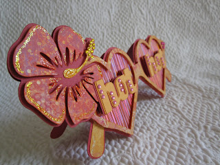
Time for another BBTB2 challenge and this week our dear and terrifically talented Heather has chosen the sunglasses from Forever Young. Sure wish I needed sunglasses the last few days, but it's been chilly and dark with sporadic rain. Not May CA weather at all. I redesigned my glasses a bit into "love goggles", you know, those wonderful things that you see your Sweetie through when you are head over heels in love that permanently erase anything but youth and beauty in your eyes. I used Cricut DS to make a shaped card using the shadow cuts of the sunglasses and welded the hearts from Cake Basics to them. A teeny amount of hand trimming was required near the nose bridge. The sparkly DP is from K&Co Portobello Road. "Hot" is also from Forever Young and is just how I see my man, even after all these years. (I'm kinda counting on him wearing them too, if YKWIM. LOL) I cut it 3 times each, glued them slightly offset, added some gems and popped them up. The cool holographic striped paper is from my LSS. I have no idea why I bought the stuff, but could it have been any cooler for this project?

I actually was gonna quit there, but the glasses looked too plain so I searched for a tropical flower and found several. I was thinkin' that it would be tucked behind my ear as we frolicked in the sand. The one I chose was from Car Decals because it had a shadow (and the ones from Life's a Beach did not). Normally I would have welded the shadow of the flower to the whole thing as well, but it was an afterthought. Thankfully I was able to peel some of the assembled layers away to insert the shadow where I wanted it and build from there. The DP is also K&Co, this time from Que Sera Sera. I love the fabulous prints and saturated colors of those lines. The stamen is actually from on of the hibiscuses from Life's a Beach because it was in one piece instead of a bunch of little circles near the end so I tweaked it in DS to make it fit and added adhesive gems and Stickles to bling it up a bit.

Here's the dimensional shot. My DT sisters HERE have done fabulous work with the cut, as always, and if you'd like to play along, remember, you can use any sunglasses from any cart if you don't have Forever Young. I'm also entering this in the current Whimsical Wednesday Take Shape Challenge which is to make a shaped card. So sorry Steph, that this is combined, but the chances of me making 2 shaped cards in a week are pretty slim and I so wanted to play along. Be sure to stop over to Whimsical Wednesday Challenges too, and prepare to be amazed. So there you have it. I'm smiling big time, still thoroughly lost in my little island fantasy and longing for the day we can run away, smash the mirrors, and see ourselves only through love's reflection. MMMmmm....perfect!


Sunday, May 15, 2011

Macabre Monday Dali Delusions Challenge


This week on Macabre Monday at Haunted Design House we're say "Hello Dali!" (Sorry, soooo cheesy but I just couldn't resist.) Our projects are inspired by the art of Salvador Dali, surrealist extraordinaire. I think his most recognizable images are definitely the melting clocks and fortunately dear Lily of the Octopode Factory not only has a digi stamp Dali's clock, but also of Salvador himself. He is also known for self portraits, and clouds so I decided to combine those three things in my project. I printed the clock several times and left one whole, printed one on top of a cloud photograph I found on the Internet and used only the center portion, and the third I cut out the center and added the portrait of Dali printed on transparency in the opening.


Here's a better view of the cloud images as seen through the transparency layer of Dali's face.


The back clock was attached to a step card with the transparent clock attached at the top and bottom. The "Artist" stamp is Tim Holtz. This was a toughie for me, but if you want to see some real artists, check out the rest of the Minions creations. Unfrickin' believable!


Friday, May 13, 2011

Tiddly Inks, Bloom Little Lillie


What a fabulous celebration we've had at Tiddly Inks for our first birthday and what unbelievable cuteness Christy has added to the already wonderful collection of images. If you've missed any of them, be sure to click HERE and prepare to be amazed. In anticipation of a new little niece, Christy has added an adorable new character to the Tiddly clan; Lilli Claire. (Tell me that name isn't the most precious thing EVER!) I had a hard time deciding which image to color first, but after perusing my DP I decided on Bloom Little Lilli. I thought the swirl on the gorgeous DP from K&Co's Que Sera Sera stack would be a perfect frame for sweet Lilli, so I cut a circle out with my Nesties and mounted her behind. Not much embellishment needed. The beautiful flowers in the corner were from Offray that I got at WalMart. the butterfly is an MS Punch. The sentiment is a Heidi Grace Rub-on and I've added a few adhesive gems. Hope you all enjoyed our birthday festivities and play along with our challenge which is Anything Goes (as long as you use a Tiddly image, but freebies can be found HERE. Be sure to check out our Fabulous Inky Friday post for more inspiration and have a great weekend.

BAh! Humbug! "Green" Challenge


Okay, I'm not really thrilled that Blogger ate my last post but I'll do an abreviated rerun just so it's here. This week's Bah! Humbug! Challenge was going Green, meaning either recycling or the color and I chose to do both. The laser cut stocking is from and old Christmas card, the Nesties frame made from Labels Seventeen. I added peelies and beads.

And popped the layers. I'll spare you my disenchantment with the American Crafts foil card stock, (the color rubs off) and all my moaning about my tooth, bescause I'm fine, the surgery took about 20 minutes total, no swelling AT ALL, and I'm eating regular food today after a fab day of ice cream yesterday. WooHoo! Thanks to those who commented on that post. I guess it's lost in cyber space FOREVER. I sure hope that doesn't happen again, Blogger, because I was pulling my hair out! Can't you just leave well enough ALONE!?

Wednesday, May 11, 2011

Happy Birthday Andrea!


Today is our dear Minion Andrea's (Agent of the Abominable's) birthday and of course, I'm running a bit late. She's a zombie lover so I just had to use Zombie Love from The Octopode Factory. Because she's a party girl, I added a party hat from Octopode's March Hare and added the bottle and glass from Tiddly Inks Toasting Properly. I colored her with Copic's and fussy cut and popped the appropriate parts and added mats cut with Nesties Labels Seventeen. The DP is from DCWV's Madly in Love Stack.


I wasn't sure you got a good look at the rotting flesh. I just LOVE coloring zombies with W3 and G21 and then use a the blending pen to make it all ooze together. Tres creeptastic, No? Her good eye has a slighty glittery acrylic dot and the other a black Rain Dot with a popped lid.


I know zombies are more associated with brains, but do you see what's poppin' out of her chest? Hence the computer generated sentiment. I considered not posting this until Andrea received it in the mail, but with my track record, she'll have forgotten all about it by the time is arrives. Sorry hon! Hope your day was fabulous!

Tuesday, May 10, 2011

Cards for Men "Someone Special" Challenge


Neither my man, nor I, are feeling particularly fit at the moment. Overindulgence and crafting (for me at least) has pretty much taken it's toll. We each complain about various body parts, yet to each other, we still look pretty darn hot. (Keepin' those love goggles on, right Baby?) The nice weather is at least getting us moving again. He's working hard outside and I'm back to my walks and workouts. So here's a card for my big strong man. The image is from the Smitten digi set from Smeared Ink. The DP is from the La Crema 8x8 stack by DVWV. The image is enhanced by Copics in the W range and inked with Frayed Burlap Distress. It's cut with Nesties Labels Eleven. The sentiment is computer generated , inked and cut with Nesties Labels Ten. The gorgeous tassel trim was a gift from Kellie Winnell, of Tickled Pink Stamps, when I was a Guest Designer. (Thanks so much, Kellie!) I've been hoarding it because Kellie only ships stamps outside of Australia so I can't order more. I'm entering it in the Cards for Men Someone Special Challenge, because no one is more special than my man. LOVE YOU, Sweetheart! xxxxxxxxx

Monday, May 9, 2011

BBTB2 Simply Charmed Strawberry Challenge


Happy Monday! Hope everyone enjoyed their Mother's Day yesterday. Now it's time for another fab challenge at BBTB2. In honor of National Strawberry Month, our sweet and fabulously talented Jeri chose the strawberry from the Simply Charmed cartridge, although those of you who don't have it, may choose a strawberry from any cart. The little strawberry looked mighty lonesome all by itself, so I added a leaf from Cake Basics and a flower from Walk in My Garden. The "berry sweet" sentiment was also from Simply Charmed and I chose Mickey Font to add "so". All of this was welded in DS to a doily, also from Cake Basics. (Might as well use that cart for something since I've never even taken the machine out of the box. LOL) "Of You" was trimmed from a sentiment from a Cuttlebug Card-Making combo and added to fill up the space at the bottom of the doily.


Yeah, it's another shaped front card. I seem to be in a rut. Sorry about that. At least I managed to do the strawberry in pink to spare you another red, black, green and white card.


So there's a little embossing, a little dimension and a few beads and a button to embellish and that's it. But there is LOADS of fabulous inspiration by the rest of the team this week so be sure to check out BBTB2.

Sunday, May 8, 2011

Macabre Monday Mark of the Beast (Recipe Challenge)


Sorry I've been MIA for several days. The gorgeous weather and lack of creative mojo has kept me away. Hope everyone had a fabulous Mothers Day. After the week of lovely weather, our Sunday was cold and cloudy. How disappointing. But now it's time for another Macabre Monday and we have a different kind of challenge for you all. Our Mark of the Beast challenge is a recipe challenge of sorts, challenging you to use 6 of something, 3 different times. Do you dare? It's sponsored by our own Devious Digital Demon-ess Susan of Crafty Chaos Designs. Look no further for the fabbiest digi papers EVER! I've chosen 6 images from the Pumpkin Carving cartridge cut at 1 1/2 inches and the word Beware (6 letters) from October 31st, and to complete the evil trifecta, I've added 6 orange adhesive beads.


Because the images were quite detailed and were originally designed to be cut larger as template for carving pumpkins, I used the multi cut function at 2 times which gave me clean and concise cuts in the small size.


The mat was also cut on my Cricut using George and Basic Shapes and Design Studio and the frame, images, and letters were all popped for dimension. And to top it off, the card measures 6x6 and has six circle openings in the mat. WooHoo! Be sure to visit Haunted Design House for more devilish inspiration and play along for a chance at the fabulous prize. I'm alsoo entering this in Papertake Weekly's Anything Goes Challenge with the optional use of circles. I think this works.

Wednesday, May 4, 2011

Bah! Humbug! Pleats and Ruffles Challenge


This week at Bah! Humbug!, in honor of the royal wedding, our challenge is to use pleats or ruffles. I'm telling you, with the gorgeous 8o degree + weather we're having, Christmas was far from my mind today, but I just couldn't miss it. I knew I wanted to do something vintage, but a number of attempts were unsuccesful so I resorted to an image and frame from the Graphic 45 Christmas Past Collection. I'd bought a number of colors of the ribbon from WalMart several years ago before I realized it was too stiff to tie a pretty bow so it's been sitting in my stash ever since. Fortunately I was able to pleat it using Terrifically Tacky Tape. The pleated medallion is from K&Co which I backed with a Nesties circle.

I popped the frame and added a peelie border to the mat and a few adhesive gems and there ya go. I still feel like I'm playing "catch up" after my birthday trip, so I apologize for my sparse and irratic comments and visits to all of your blogs. Please forgive.

Tuesday, May 3, 2011

Tiddly Inks Mother's Day with a Vintage Vibe


Less than one week 'til Mother's Day and the Tiddly Inkers challenge is to create a Mother's Day card with a vintage vibe. I decided to make a Mother's Day card for a brand new mom using Lullaby. (Of course it could also work as a Baby card) It's cut with a Nesties Circle and fit into my Spellbinders Decorative Oval Window from Heartfelt Creations. The pretty vintage paper is from the 8x8 Once Upon a Springtime pad from Grahic 45 and the gorgeous vintage shabby crinkle ribbon is from the Alice Bundle from Prairie Bird Boutique sent to me by my dear friend Stephanie (perfect timing there girlie, thanks so much!) I'm pretty sure the sweet charm came from J's.


I love the way the circle image fit into the frame and I popped the whole thing up for dimension. Details on the frame were inked with Spun Sugar Distress Inks and the sentiment was computer generated. As usual, my teamies have done a fabulous job with the challenge so be sure to visit the Challenge Blog, take a look, be inspired and hopefully play along. Also, the 25% off sale is still going on through TODAY at the SHOP so now's a great time to check out all the gorgeous new images and snag a few of your old faves too. and there's also still time to complete the Treasure Hunt Blog Hop so if you haven't checked it out yest click HERE. And we're still celebrating Tiddly Inks birthday so stay tuned for details of our next party, coming May 10th.

The image is colored with Copics on some of the most fabulous card stock I've ever used. Have to detour a bit to give it a plug. I normally just use crap paper (or I guess I should say inexpensive 110 lb. white card stock by Georgia Pacific from WalMart) because I mess it up frequently so it's way more cost effective for me. I know people swear by all sorts of fancy brands but I'm too lazy to sort them out so I don't bother. However, when I bought cheap cream colored card stock it was WAY to porous for my Copics. Sometimes you just need to stamp or print on cream so when I was over at MFT I saw these Cream Perfect Paper Panels. Worth a try. I printed an image out first on regular copy paper and then taped a panel to the paper and ran it through my printer again. Then I colored and messed up. Mom looked like she'd been baking under a sun lamp and the baby had jaundice. Oh dear! I tried to fix it by coloring more. Hmmm... Then tried using my using my colorless blender. Hmmmm... Anyway, I used alot of ink and eventually gave up. Gonna have to print again and start over. CRAP! And on my fab new card stock too BUT, when I turned the panel over there was NO bleedthrough. None, Zero, ZIP! I actually turned my piece over and reprinted it on the other side. I chose my colors more carefully this time and did an acceptable job. I kept thinking when I colored on this side the color would come creeping up from behind, but it didn't. ARE you KIDDING me? I LOVE this stuff! (This was totally unsolicited. I was just blown away and had to share. xx)